Visual Trends That Can Revive Your Instagram Feed
If you are feeling running out of ideas when it comes to branding your Instagram, keep scrolling this post. You will come to know about some visual trends on Instagram that you will keep you inspired.


It’s true that Instagram can be a little daunting affair, especially for the businesses that have other marketing and social media related tasks present on their checklist. But, the fact remains the same that Instagram is one of the best marketing channels which gives you a great way to connect with your targeted audience in a meaningful manner.
Now, here are some Instagram marketing tips that help you to give a boost to your business-
- Monochromatic Color Scheme:
A trend which is highly prominent right now on Instagram is to post pictures that feature the same one ( or two) color. This trend works very effectively for the brands which have a strong visual identity. In fact, some of the brands have so much visual identity that we start to connect one color or color scheme with that brand. Tiffany Blue, T-Mobile Magenta, Pepto Bismol Pink are some of the excellent examples. A monochromatic feed is a nice way to enforce your brand’s identity on the Instagram while, maintaining a clean and fun theme.
The best part of using monochromatic color schemes is that they allow users to focus on the content subject, as there’s no chance of getting distracted by different colors. You can use this to the advantage of your brand promotion as the audience is more focused on your content.
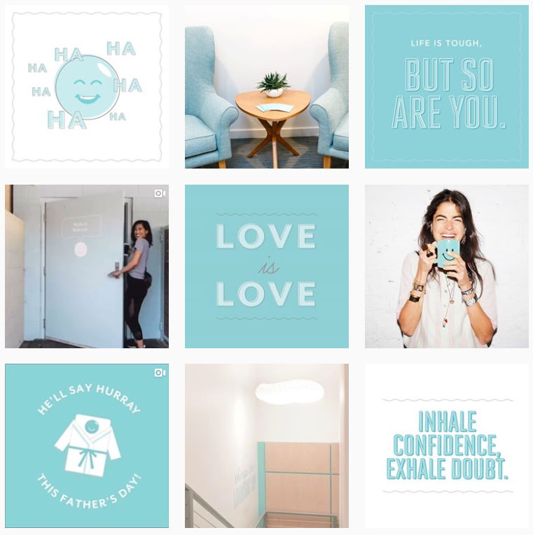
Massage chain Squeeze sticks to a light blue and white color scheme on its Instagram feed. The soft color combo isn’t just nice to scroll through – it also reflects a spa-like feel that matches the company mission.

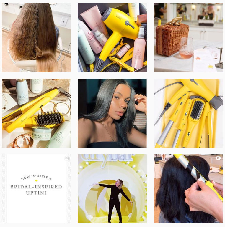
Drybar (from the same founders as Squeeze) also plays with a monochromatic palette but in a much looser way. The brand’s signature banana yellow appears as a “pop of color” throughout the feed, usually as a Drybar product.

- Puzzle Layout:
The puzzle layout is one big trend on Instagram that carves one larger photo into smaller split images. The split images are posted one by one and, when viewed from the Instagram profile, come together to make one cohesive look.
A lot of celebrities have recently hopped onto this particular trend when launching a big project or something secret, as it keeps their followers waiting on their toes finding what larger image will reveal. Brands are also using this same layout to create a sense of anticipation among the fans and followers, to make them wonder what’s around the corner.
Here’s an example of what a puzzle layout looks like on Instagram-
Digital Collage:
We have recently found 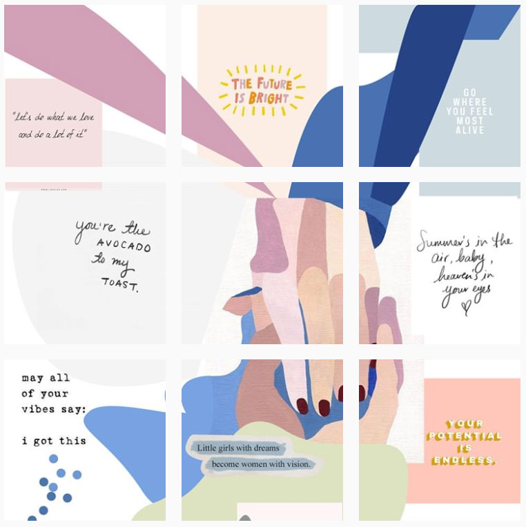

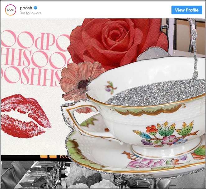
The digital collage allows you to display all the elements of your brand, while still adding some unexpected flair to the mix. This artful format lets you play with the imagery and tell a beautiful story, which keeps your audience engaged.
Take a look at this digital collage from Poosh, a new lifestyle media brand by Kourtney Kardashian. The flowers, glitter, and fine china combined to create an on-brand mood of opulence.

New Dimensions:
Instagram images are all displayed at the same dimensions in a profile – that’s what makes all the images line up so perfectly. But as long as the dimensions of your upload are correct, you can play with the size of your image within the frame. Take a look at how popular photographer Joe Greer frames his photos on Instagram
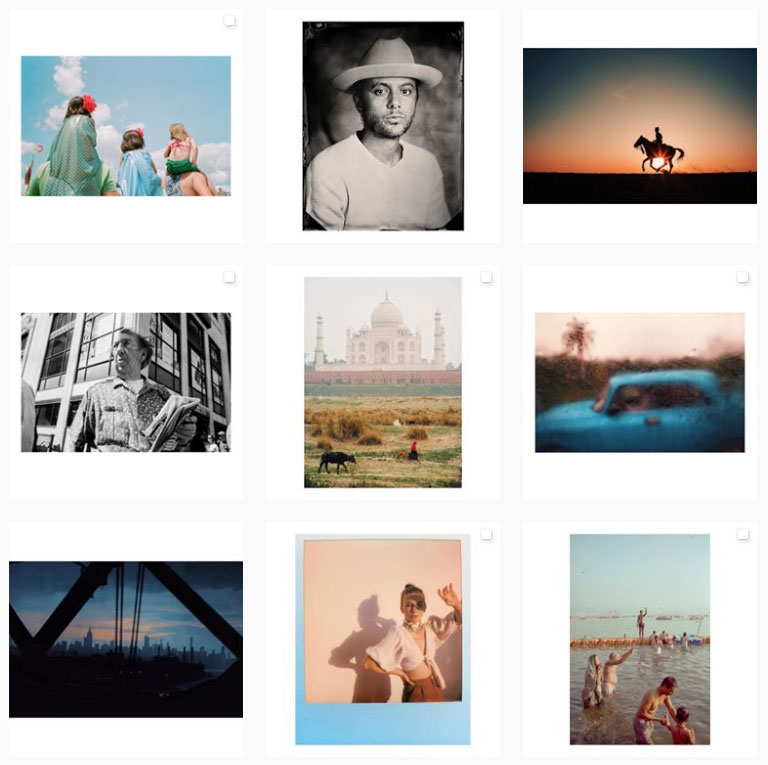

It’s true that this layout format works best with the photographers, but it’s something that any brand can do experiment with.


