10 Instagram Tips For Photographers
Small pictures can make a big difference in a mobile-driven world.
Quite often other photographers tell me “I don’t have time for another social network and I don’t need Instagram.” Yet they spend hours posting on Facebook, 500px and Flickr where almost zero potential clients will see their work.
They’re basically getting followers, likes, and comments coming from other photographers. Instagram can be useful in ways you might not have thought of before, and it shouldn’t take you too much time to build a presence on it.
In this article, I’ll try to share a bit of my experience on this social network as a photographer (@zellersamuel 12k followers) and how it benefits my work.
1. It’s not your portfolio
Think of Instagram as a way of showing your latest work or use it as a daily journal. I can’t count how many times I had to show someone a picture from a recent shoot on Instagram because I hadn’t yet added it to my portfolio.
Not only can you post images you wouldn’t usually put in your portfolio, but you’re also free in terms of content—no need to show a series of work, a single photo will do.
It can even act as your business card. I’ve had to give my Instagram username before because I ran out of cards; the other person can quickly check out my feed and follow me.
It is also a way to show images in a less formal, more playful way. People are often interested in behind-the-scenes shots, or little things that they would not find on your website. Take advantage of that.
2. Keep your bio neat and tidy
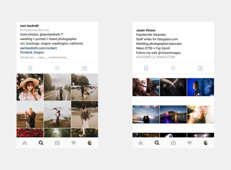
Your username and bio are the first thing visitors will see when they land on your profile—they’re important and should be crafted carefully.
Two things are often forgotten: email and location. Include your email to show potential clients and peers where they can contact you (for work or collaborations), and add a location so they know where you’re based.
![]()
![]()
There are only two things that are referenced by Instagram on your profile, your account username and your account name. When you do a search, it will only look for the content in those two fields (as well as for hashtags). Speaking of which.
3. Hashtag the right way
Hashtags can have both a good and a bad effect on your reach and engagement. If you use them incorrectly you’ll just end up receiving more spam comments and likes from bots rather than real humans.
As I mentioned in my previous article “Why I don’t use the most popular hashtags” there are quite a few things you should consider when picking the tags for your next posts.
First and foremost, don’t bother using common words like #photographer, #photography, or #sunset because they are overloaded with millions of images (new ones every second) and your pictures will not “live” long enough on the hashtag page for other users to see it.
A good hashtag is searched for often but not overused.
A good example is #justelimage which is a tag specific for minimalistic photography. Or #fujifeed a tag for Fujifilm camera users run by Fujifeed.
I wouldn’t recommend using a hashtag that has more than 250,000 entries on it except if it’s a very specific one filled with good images. Common words such as #happiness and #love are prone to spamming, and there are often bots configured to auto like and comment on those tags set up by companies to advertise themselves.
One last thing: don’t write your post description with hashtags on every two words like “this is a #sunset that I #photographed in #Switzerland” because, firstly, it will make you look like a teenager and, secondly, it’s not very legible.
Put your hashtags at the end of your post and try to limit yourself to 15 of them. 30 is the limit, but it’s a big mess.
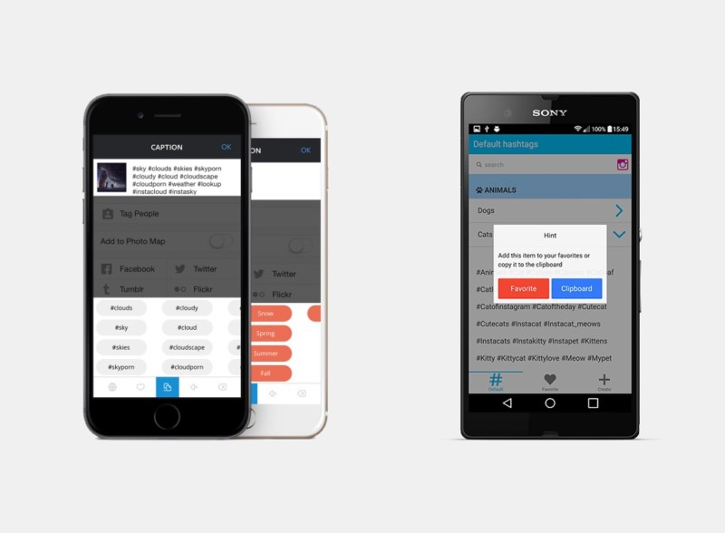

To manage your list of custom hashtags, I suggest you to try the mobile apps Tagsdock (iOS) or Favtags (Android). They will save you tons of time by letting you create custom lists of tags you can then re-use easily in your posts.
4. Stay consistent
Keep in mind when you build an audience that the majority of it will expect you to keep posting the same kind of images. For example, I post mostly architecture and editorial photography and my followers like that style.
When I post a portrait it always gets less engagement, not because it’s bad but because my body of followers are mostly into architecture photography.
You shouldn’t restrict yourself in posting only one genre, but try to be consistent in your posts. This will ensure that your images always reach the optimum number of people.
Someone that lands on your profile will most likely follow you because of the images they see at the top. If those 9 last posts are a mess—a mix of a lot of genres, for example—then maybe they will not hit that follow button.

Think of your Instagram account as a physical store: the front window present a selection of articles, and then inside you’ll find the more eccentric items.
The storefront is what make people decide whether or not they should enter or continue walking down the street. This also applies to your portfolio and your blog.
5. Square or not square
There’s a huge difference between posting square images, horizontal/vertical, or using a white border. All have pros and cons.
Square images
It’s how the app started, so people are more used to it. But regarding of psychology, they don’t appear as classical photographs. We’re too accustomed to seeing rectangular images in magazines and galleries to acknowledge that a square can also be a photographer’s work.
Pros: your image is the same between the thumbnail and the bigger view.
Cons: it doesn’t make people think “ok this is the work of a photographer”
Vertical images
They look really good and take up the most space on the user’s screen, but for some photographers it’s a bit more difficult to compose them. Also, they have a slightly different aspect ratio than the files that come out of your camera (which means it’s gonna be slightly cropped).
Pros: it’s gorgeous and big and full of details (resolution is the highest).
Cons: you cannot control how Instagram crops the thumbnail version.
Horizontal images
Very classical, they instantly say to the viewer “look, I’m a photographer.” They’re a bit smaller than squares and vertical ones but at least you keep that sweet landscape ratio.
Cons: you cannot control how Instagram crops the thumbnail version.
Images with a white border
These are perhaps the strongest indicator to people who land on your profile that you are a photographer (amateur or pro) and not just someone posting his snaps. As an artist, you understand the importance of the ratio of an image, as well as the need for empty space around it.
By framing it with white you clearly show to people that your image is intended to be seen like this, you control that viewing process.
Pros: it will make you look more professional. You don’t have to make the viewer click on a thumbnail to see the uncropped version.
Cons: you have less chances of being “regram’ed” (published on other Instagram magazines accounts or groups) because of that white border. Many of these accounts post only squares or vertical/horizontal images.
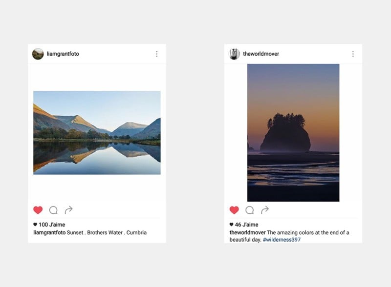

In conclusion, no one option is better than the others. I choose to post only horizontal and vertical images with white borders because I don’t want Instagram to crop my thumbnails as squares—I also don’t fancy the ratio of my image to be fixed and constrained by Instagram.
It’s a bit more work but the results speak for themselves.
I use Photoshop and a .psd file I made which contains both horizontal and vertical templates, then I export as .jpeg to my Dropbox, open the picture on my phone, and post (this allows me to do last minute edits to my images).
Or I use an app like Squaready (available on both iOS & Android) to add the white border directly from my mobile phone—fast and effective.
6. Timing is a key
Publishing images should be done regularly. In order to be the most effective, find a pattern and stick to it. I’ve tried uploading pictures every day and every three days and I still had the exact same level of engagement. But as soon as you break the pattern, your stats will just drop.
Forget to post for a few days? Your next image will have weaker impact.
People get used to seeing your content popping onto their feed at regular intervals. The positive thing I noticed when you post regularly but not too often (for example, one image every 3 days) is that your images globally get more reach, because they stay on top of your profile longer.
7. Be polite and reply
It is probably the most time-consuming aspect of Instagram, but also one of the most important: when someone who follows (or not) your work leaves a comment, it is good etiquette to answer. It will probably drive that user on your profile for a second time, and they may follow you or simply appreciate the fact that you consider your followers and fans humans and not just like factories.
Because Instagram is open (unlike Facebook and LinkedIn, where you need to be a friend or “connected” to each other) commenting is often a good way to get in touch with potential clients in a less formal manner. I got in touch with an agency in Berlin like that.
Nowadays I bet you’ll have a better chance of getting noticed by leaving a comment on Instagram instead of sending a company an email to their generic “info” address.
Don’t be afraid to use emojis, according to many studies it increases your chance of getting your comment noticed among others ? (notice how you stopped scrolling there because of that wink?)
8. Use this visibility
We live in a mobile world, you have a million times better chance that some photo editor will stumble on your Instagram account rather than on your portfolio (even if it’s well-referenced and cross-linked).
The simple reason is that we mostly browse the Internet from the devices we always have with us, our phones or tablets. Instagram is used by a ton of curators, companies, brands, and agencies looking for talent.
Your past and future clients may already use Instagram.
The bigger you grow on this network, the more job offers you could receive. I was recently invited by the Olympic Museum to attend their press day and capture some images, and it was mainly because of my reach on Instagram. I was hired to cover a Swisscom event for the same reason.
Below you’ll find some of the images I made for those two clients.
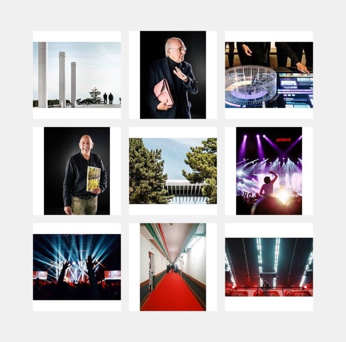

As an influencer, you have the chance to connect with bigger brands that you could not approach any other way. The best thing about those clients? They hired me because of my own style and gave me freedom to do images my way.
9. Keep things simple
People’s attention span is shorter than ever before, especially on this social network. They won’t read a long description.
The average human attention span has fallen from 12 seconds in 2000 to 8 seconds today. Goldfish, meanwhile, are believed to have an attention span of 9 seconds.
But this isn’t an excuse not to write anything under your images.
I get a bit upset when a photographer posts a picture of a very good looking building without indicating the location (using the location tool) or without mentioning the name of the place or the architect. People are interested in the context as well as the content.
Keep your description short and to the point.
10. Have fun
This won’t replace your portfolio or traditional networking. Keep cool and share when you want to share, publish the images you want to publish. It shouldn’t take you too much time/effort, and if you act too professional people will eventually get bored of your content.
Find a balance between the formal and the light-hearted.
Instagram is a beautiful community where I’ve met a lot of real-life friends and had shared a ton of very good memories. It’s a place were I can get real feedback; a place that makes me push myself to create new images every day.
It’s lively, it’s fun, and I will continue to use it until the next big thing comes along…
About the author: Samuel Zeller is a Swiss photographer and Fujifilm X-Series ambassador. The opinions expressed in this article are solely those of the author. You can find his work on his website, Instagram, and Unsplash. This article also appeared here.


